
A boutique site that feels like walking into the shop.
A full-service bridal and formal wear boutique in a historic Southern town needed a website with warmth, a clear path to booking, and a designer showcase the owner could update herself.
- Client
- Willow & Main Bridal (name changed)
- Role
- Palette, design system, WordPress build, custom plugin
- Timeline
- Home Page - 2 days
- Deliverables
- Homepage, appointments page, color guide
The brief
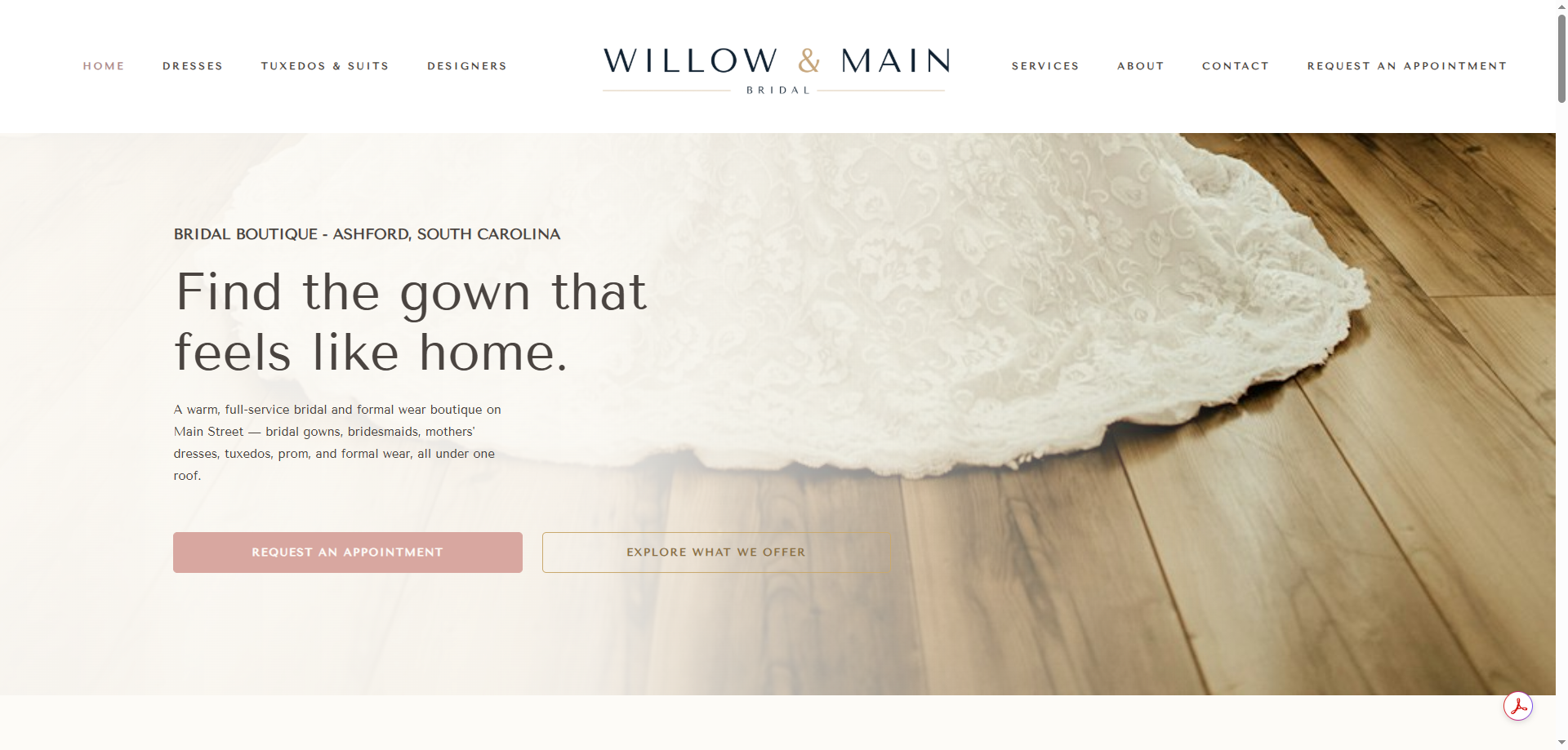
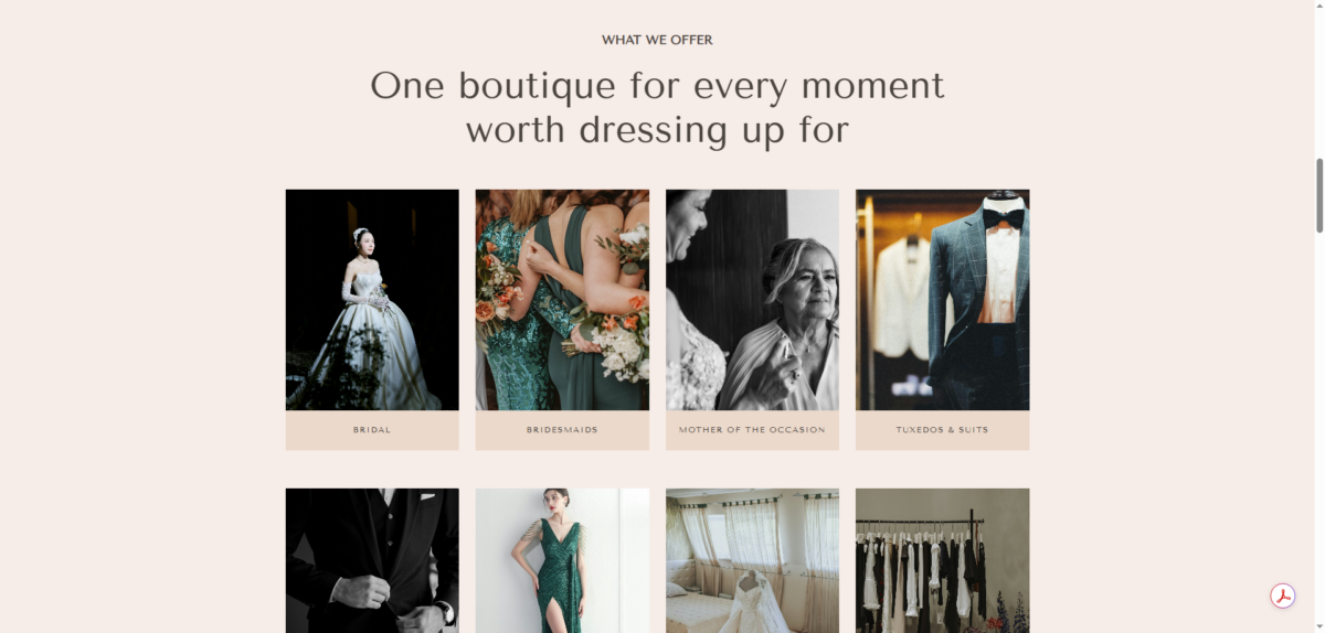
The boutique wanted modern Southern luxury without the intimidation. Neutral tones, a sense of place, and four things that had to be on the page: an appointment area, an about-us section with staff, what they offer, and the designers they carry.
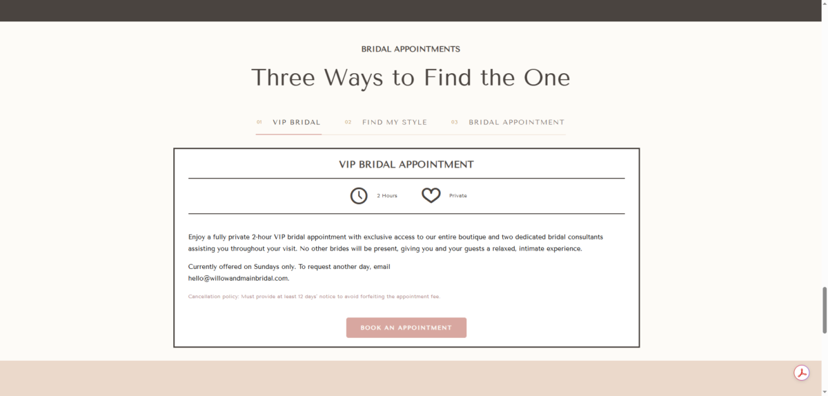
Booking ran on BridalLive, an industry point-of-sale and CRM, with an embedded widget that can't be restyled. The only logo on file was a CMYK JPG on a near-black background. Those two facts shaped more of the design than the mood board did.
Constraints
- BridalLive's booking iframe had to stay, as-is, and still look like part of the site
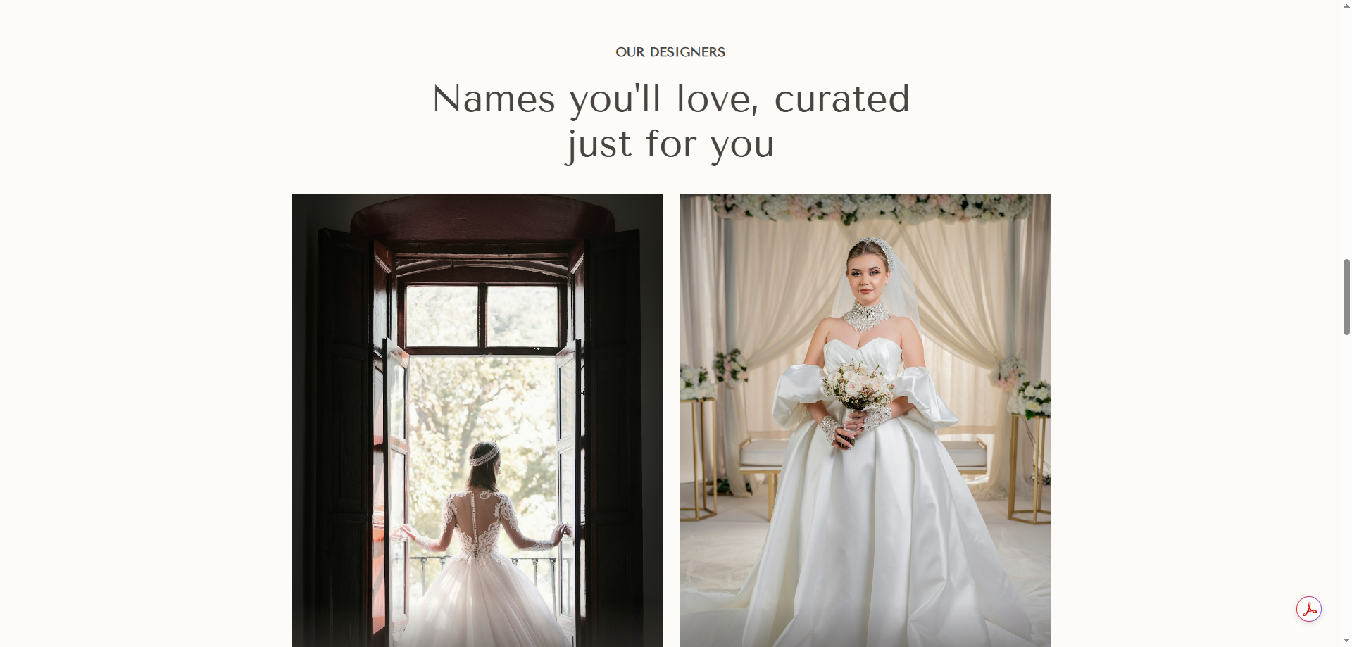
- The shop owner had to be able to add a designer without opening the page builder
- One brand, many appointment types: bridal, bridesmaids, formal, tux
- Neutral palette, but every booking button had to be unmissable
Dusty rose is used for exactly one thing on the whole site: booking. The eye always knows where to click.
What I did
Palette and system first. Seven candidate palettes, narrowed to a blend of two: soft marsh-mist neutrals for backgrounds, deeper indigo heritage tones for structure. Off-white page base, cream section bands, indigo headings and primary buttons, dusty rose reserved for booking, seafoam and sage alternating as accents, blush for the VIP block, brass hairlines. Tenor Sans for headings, Figtree for body. Every color was mapped to a BeTheme Theme Option and a per-section BeBuilder value before a page was built, so the site stays consistent when pages are added later.
The build. A BeTheme wedding template was the starting point; most of it was rebuilt. The homepage opens on a full-bleed header with the bride's full gown visible at every screen size (two crops, one wide, one tall), then services, designers, the team, and booking. The appointments page gives brides two clear paths, a Bridal appointment or a Find My Style session, each as its own card, with the BridalLive widget embedded below.
How it came together
-
01
Palette before pixels
Seven palettes, two finalists, one blend. Documented as a color guide with Theme Option and BeBuilder values before any layout work.
-
02
Template, then rebuild
Started from BeTheme's wedding template for structure, replaced nearly every section to match the design system.
-
03
The logo problem
The CMYK JPG clashed with the indigo header. A transparent version turned up on the client's existing site; the header moved to black to sit cleanly behind it. Small problem, real-world problem.
What this explored
How to build a boutique site around a booking system you can't restyle, and how far a documented color system goes toward keeping a BeTheme site consistent after handoff.
The reusable pieces: a color guide mapped to theme settings, a designer carousel the owner runs herself, and an appointments page pattern that works for any shop with more than one kind of appointment.
See the preview siteBuilt with
- WordPress
- BeTheme
- PHP
- BridalLive
- Tenor Sans + Figtree
- Illustrator
Got something similar?
Tell me what you're working on. If I'm not the right fit I'll say so, and I'll usually know who is.
Start a conversation